Design 101: Top 5 Design Mistakes I Want You to Avoid
We’re all friends here, right? Well, I’m that friend that won’t let you go out with spinach in your teeth or your tag hanging out of the back of your shirt. So, of course, I’m going to help you steer clear of these common design faux pas.
Rugs that are too small
One of the most common mistake is I see in spaces is either no area rug or worse, a rug that’s too small. It makes me sad to see postage stamp or post-it note sized rugs in a room that requires something 10 times the size.
My rule of thumb is this: your room needs a room-sized rug. And the bigger the room, the bigger the rug needs to be. In a living room, dining room or bedroom, go for at least an 8 x 10; in a breakfast area, go for at least a 5 x 8. Of course, there are caveats and exceptions to this and yes, room sized rugs cost a few more $$$, but trust me, this will help you avoid the postage stamp look and you will thank me when you see how much of difference the right sized rug can make.
Here are a few guides from Serapi Rug Gallery that are also super helpful. I agree with most of them, but you have to be very careful. They’re showing some very small scaled furniture in these living rooms. For example, they show a 5 x 8 rug as a “DO”. Just know that this would only apply to child-sized furniture! There’s now way you can fit 2 adult sized chairs (that aren’t dining chairs) side by side on a 5’ wide rug. Not going to happy. DON’T DO IT!
This one is much more realistic and reliable.
Curtains that are too short
Please, friends. Put your high-water curtains out of their misery. This is not ok.
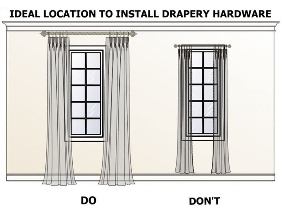
Friends, we want our hardware high and wide and our drapes kissing the floor. It can be a peck of a kiss, just barely grazing the floor, or it can be a full-on make-out session where your drapes puddle a little bit. Totally up to you and the look you’re going for. ¯\_(ツ)_/¯
I love this guide from Apartment Therapy. Not only does it talk high and wide, but it also discusses hardware size and panel width, which are equally important.
Furniture pushed against the walls
Most people are unaware that they’re doing their rooms zero justice when they push all of their furniture up against the walls. I know a lot of them think they’re making the space feel larger by creating this big open space in the middle, but all their doing is chopping up their usable square footage and loosing no less than half of the functionality of the room!
You should pull your furniture into an arrangement that makes TV viewing and conversation having effortless. People usually like to see and hear each other when trying to a have a conversation and your guests will appreciate being in viewing distance of the TV when their over for movie night or the Superbowl. Just saying. ¯\_(ツ)_/¯
Art hung too high
Art is meant to be viewed and admired, but if people have to crane their necks as if they searching for shooting stars, there won’t me much viewing or admiration taking place.
You should always try to hang your art where the center is at eye level. For most people, that means that the middle of the piece is about 64” to 66” above the floor. If that piece of art is being hung above something like a mantle or sofa, you want to make sure that the art is close enough to the piece to be friends, about 2” to 8” above that piece. Any more than that and your art may feel as though it’s floating off into space.
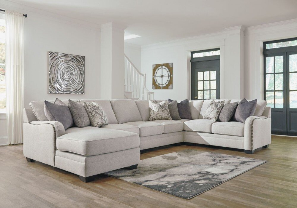
Matching furniture sets
Of all the common mistakes people make when it comes to design, this one may be the one that hurts me most. Furniture stores are not the place to walk in and ask for the #2! These furniture sets may be convenient and you may even like them, but so is the Big Mac combo and McDonald’s, but that doesn’t make it good for you!
We’re all multifaceted creatures that are made up of all kinds of layers of personality and history and that’s exactly what our homes should reflect. Layered, collected and multifaceted.
I’ll be back to break down each of these topics into much more detail, like: how to select the best rug for your space and the best sources for them, all things art and furniture layouts to consider for certain types of spaces. You guys are my people, so what knowledge and tips I have, I want to share. Especially if that knowledge will help you all make informed decisions for your spaces that you can be proud of. Stay tuned!


