Davin's Room: A New Tween Haven
Hey friends! It’s finally here! Davin’s room is ready to make its worldly debut! It’s about 95"% complete since we’re missing a few art pieces, but Davin is love with it and so am I!
Davin’s room is pretty much the last frontier of rooms inside our home that I have any design say over (check out our kitchen, dining space, office, guest room, primary bedroom and bathroom). When we first started this makeover back in September, I was a bit embarrassed and even felt guilty about that fact. I realized that Davin had watched me transform almost every single space in our home except for his and it honestly broke my heart. So when it came time to give him a space he deserved, I knew it would warrant all of my attention and creativity. Boy, did it!
Davin’s room before (on a very bad day LOL)
Not only did I want to give my son the most amazing space in the house, I wanted him to have full* autonomy over the design. (*with my guidance, of course). I wanted the end result to feel like something he would’ve done on his own, but completely elevated by an interior designer’s touch. I’m beyond proud to say, “mission accomplished!”
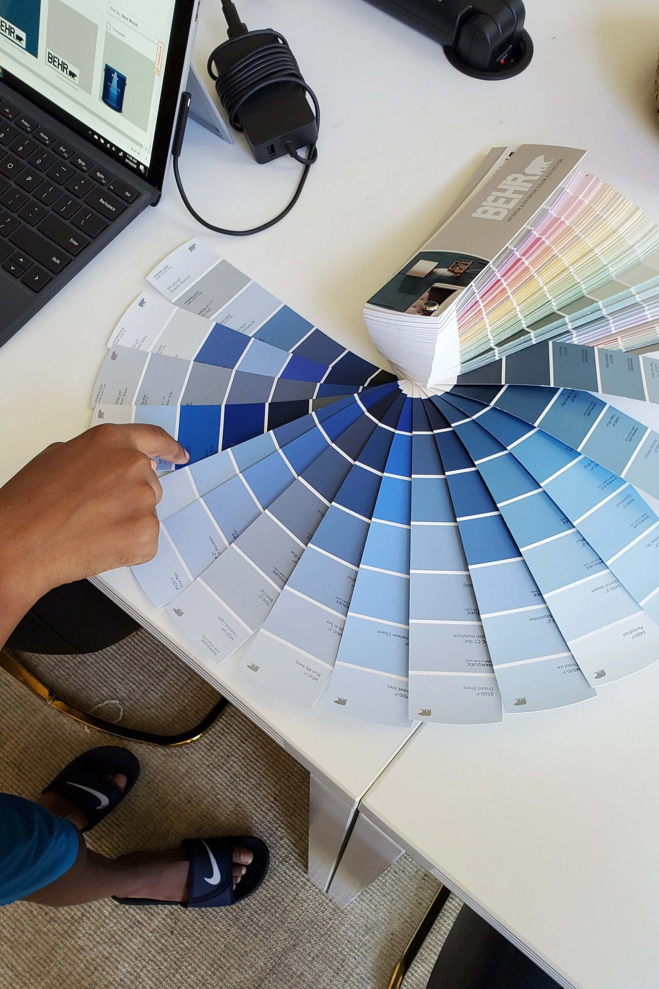
Everything began with a new color pallet. I asked Davin what color he though his walls should be and he said blue and red. After a little negotiating, I got him to settle on just blue. I broke out my paint deck and pulled out the entire section of blues to see what he was most drawn to.
A lot of people asked me how I was able to let go and allow Davin to make his own decisions. The key to it all (even designing with a spouse), is to only bring to the table options that you’d be happy with. Yes, he had full autonomy to choose what he wanted, but always give him options that I could be happy with, no matter which one he chose. Luckily for me, as long as his walls ended up blue, he was happy. I got to manage the importance of undertones, etc.
He picked out his favorites and after a trying a few samples, we settled on Behr Paint’s Dark Cobalt Blue (PPU15-03). You guys know I love bold color, but this was my first time venturing into “electric” territory! LOL! I was definitely hesitant, but am so proud of how it turned out.
Now, when it came to furniture, we were blessed to work with Article and their new fall collection. Their entire line is filled with modern and mid century styled furniture, so I knew we’d find exactly what we needed. I really wanted to embrace the not-so-subtle blue and make it even more of a statement, so we decided to go with the queen Sera Leather Headboard in Oxford Blue leather, the Embrace Chair in Mercury Blue and the Svelti Office Chair in Deep Cove Teal.
To warm up the blue, I wanted to incorporate some wood storage pieces. Article’s Lenia collection is the perfect walnut finish to do the job. We got both the 4 Drawer Chest and the 2 Drawer Nightstand.
To round things out, I added the Solina White Terrazzo Stool and Narro Black Side Table as accents, along with an IKEA Micke Desk, which is the perfect size for creating work area in the space.
Once all of the big items were in, including the Thalia rug from Ruggable, I hunted down new bedding, customized a set of IKEA Ritva drapes and added some incredibly personal touches with the artwork. So, without further delay…here it is!
Custom neon sign from Brite Lite Tribe in champagne colorway
Above Davin’s bed is a custom neon sign gifted to us by the amazing owner of Brite Lite Tribe. It says “here for you” and is a portion of a hand-written note that my mother gave to me on one of our last Mother’s Day together. Her note said “P.S. Know that I love you dearly and I am always here for you and Davin.” Brite Lite Tribe was able to create the sign in my mom’s handwriting and I couldn’t think of a better place for such reassuring words than above the sleeping head of my son.
The mural wall was done by my friend and amazing artist, Frances Berry Moreno. We have a few more art pieces coming for the space, but her mural set the foundation.
The dinosaur art was another Frances idea. She bought a set of toy dinos, a shadow box frame and yellow spray paint. After she gave the dinosaurs a couple coats of paint, I hot glued them to the linen backer in this grid layout. Such a simple and quick project, but easily one of my favorite pieces in the room!
Like I said in the beginning, this room is about 95% done. There are a few more additions on the way and a few tweaks I’d like to make (replacing the bed skirt with something more structured and replacing the hanging plant with a mobile to name a few). But all in all, I’m so proud of how this space came together and love how much Davin loves it too!


