Saturday Styling: How to Style a Bookshelf (look 1)
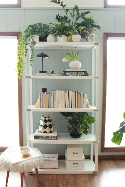
Happy Saturday peeps! It's time for another much anticipated and highly requested Saturday Styling post! Let's talk about bookshelves, shall we!?
When it comes to levels of styling difficulty, bookshelves are what some would consider
advanced
. They require much more time, thought and styling pieces than any other display surface that I can think of. And unlike other surfaces like a console, nightstand or counter top, there isn't always an inherent function that immediately tells you what should go on them, hence why so many people are so lost when it comes to making them beautiful.
People incorporate bookshelves into their homes for multiple reasons: to house their books, display special treasures, to add height to a room, etc., but most don't have a final look in mind when they bring that bookshelf home. I like to consider the following:
1. Always include books. That's their whole purpose.
2. Consider the room: This will likely help with its function. (example: If you're big on entertaining, in a living or dining room, you may need a couple shelves for a bar and bar wares.)
3. Aim for a cohesive color scheme. Since its such a concentrated space, make sure all of the colors and textures play well together; otherwise, you just have a visual mess on your hands.
4. Depending on the width of your shelves, try to display only 1-3 vignettes on each shelf. If your shelves are longer than 40" wide, you can go for more.
My bookshelf is just a catch-all for things that don't fit or have a home elsewhere. And, although it almost never gets the attention it deserves, the piece itself is still very important to me. Its actually the very first piece of furniture that I built almost 7 years ago! You can check out the
.
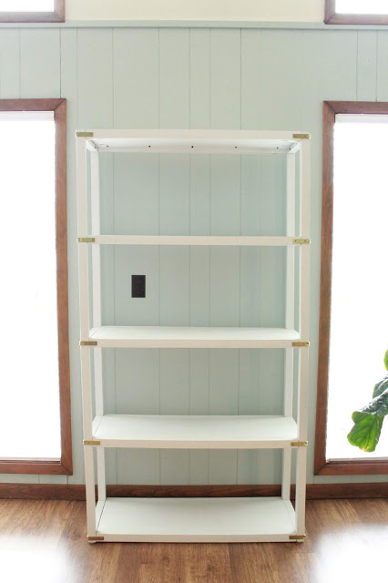
Here's what it looked like before getting any attention.
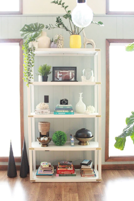
Not awful, but there was no rhyme or reason to what was on it or why. I had to start with a blank slate, so off everything went.
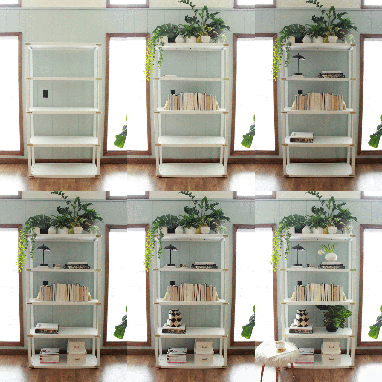
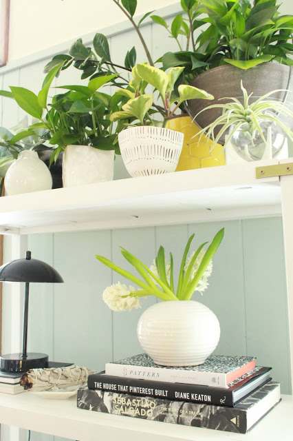
This side of our living room gets tons of natural light thanks to our floor to ceiling windows. I thought the top shelf would be the perfect spot to create a house plant haven. Since they're so heavily clustered, this is considered 1 vignette.
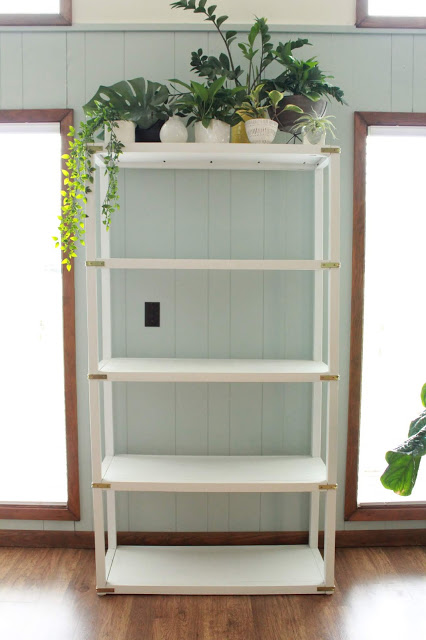
Pro tip: mix your faux plants with real ones to make them look real. Can you guess which ones are fake?
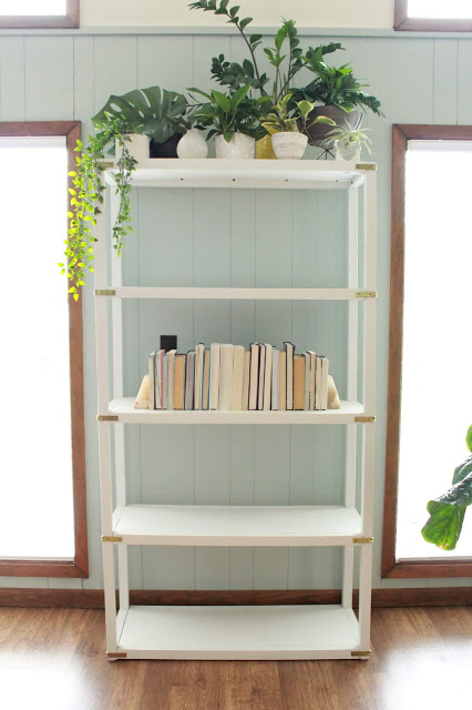
Since I displayed 1 vignette on the top shelf, I knew I'd want at least one other shelf with 1 vignette for balance. This time, it was a group of books. I faced their spines to the wall so that I didn't have to contend with all the different colors of each book. No visual mess.
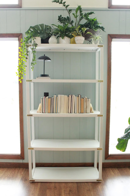
Lighting isn't always necessary on a bookshelf, but it makes for an unexpected, but pleasant surprise. This tiny domed touch lamp fit the bill perfectly.
Next, I lay down coffee table books to set the foundations of my other vignettes. One hefty stack for the second shelf...
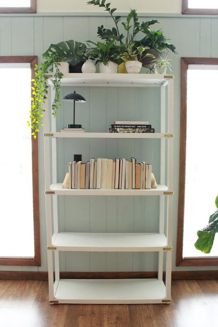
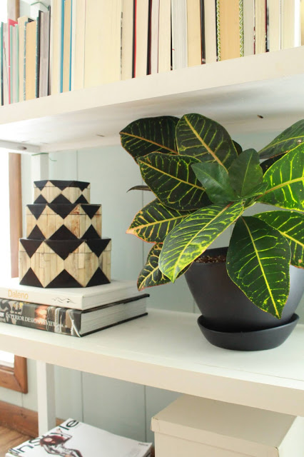
...and one stack on the 4th shelf.
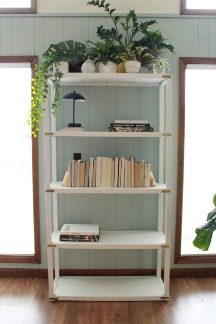
The bottom shelf of bookcases are probably the most utilitarian. They're great for housing boxes that corall the not-so-pretty items. Things like board games, kids toys, mailing supplies, etc.
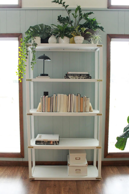
To round out the bottom row, I added my hefty stack of fashion mags that I just can't let go of.
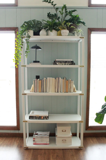
Now that the foundations are laid, I build up my vignettes. A set of bone inlay boxes top my stack on the 4th shelf.
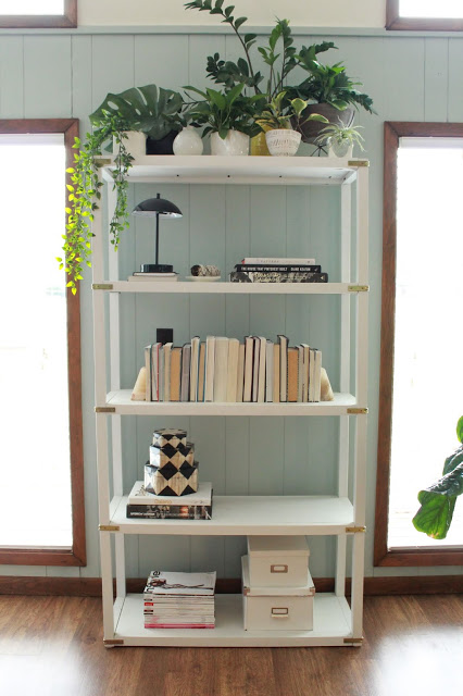
A round vase of hyacinths top my stack on the 2nd shelf.
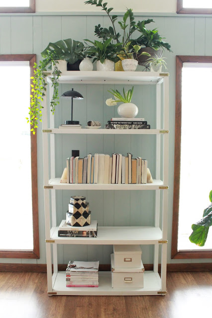
And a healthy croton plant finishes things off, still getting lots of light from our windows.
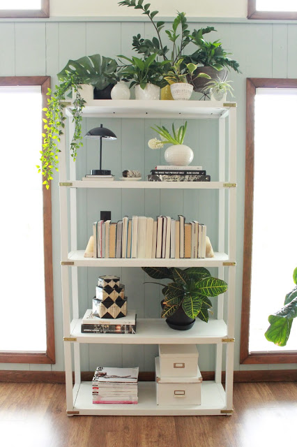
And there you have it!

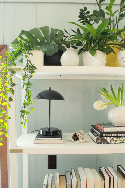
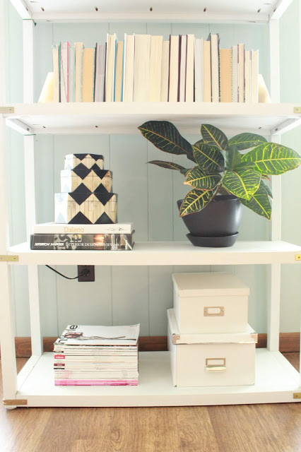
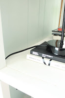
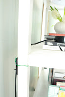
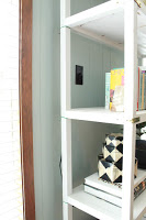
Pro Tip: If you're including lighting, hide your cords! I simply tucked the cord of the lamp behind the back rail of the bookshelf and used twist ties to secure it.
I'll be back next week with a 2nd look that incorporates some very specific requests from you guys! ; ) In the meantime, enjoy this gif that speeds up all the steps above!
