Nubi House: Our New Serengeti Hallway
Hey peeps! Happy Saturday!!!! I know you’ve all been on the edge of your seat, waiting for this reveal and I want to make sure I do it justice! So…that of course means lots and lots of photos! All I ask is that you DON’T BYPASS THE PROCESS AND SCROLL RIGHT TO THE END! You’re going to miss out on all the good stuff! I want you to savor every moment of the before, the during and of course, the AMAZING afters!
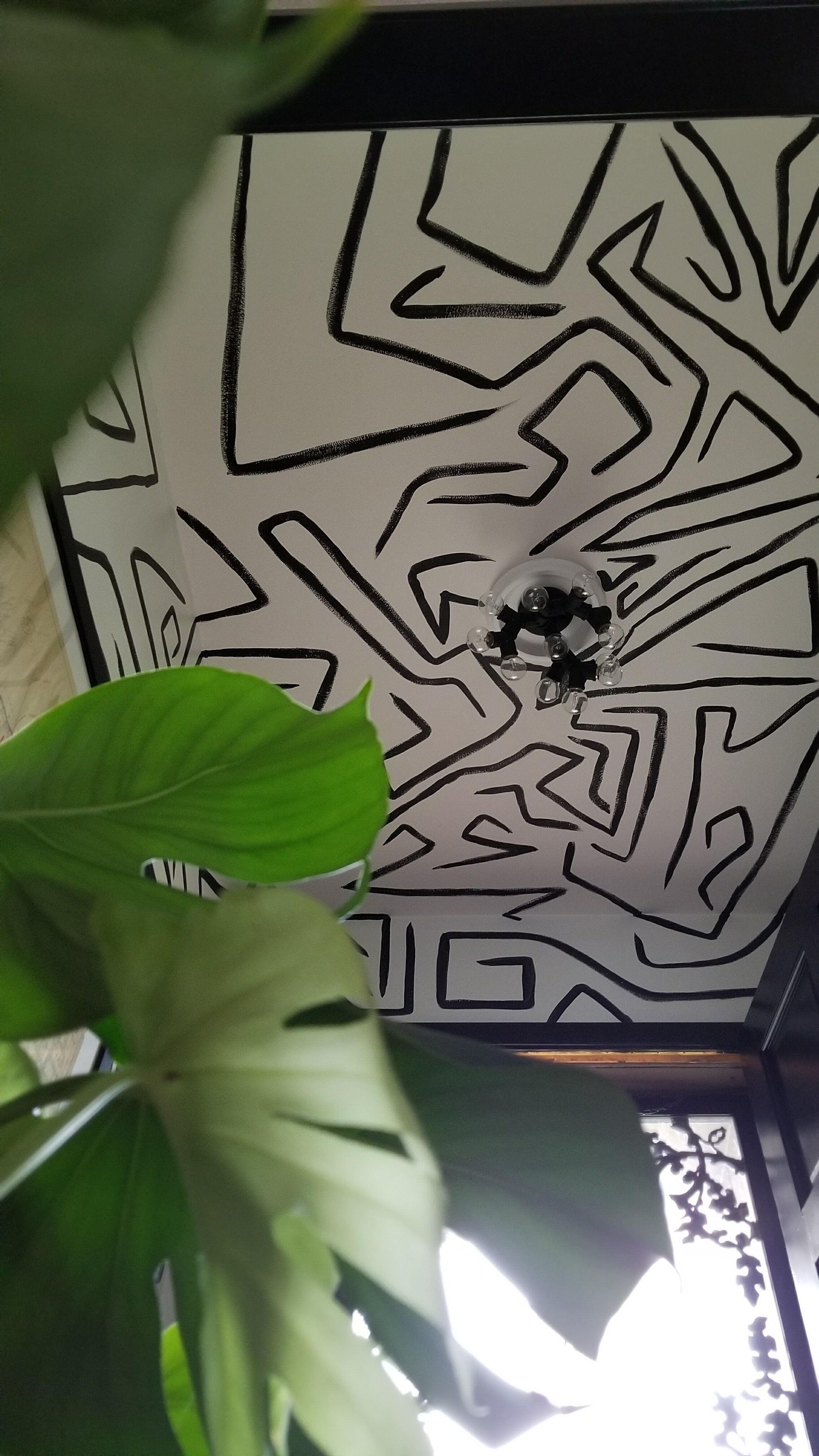
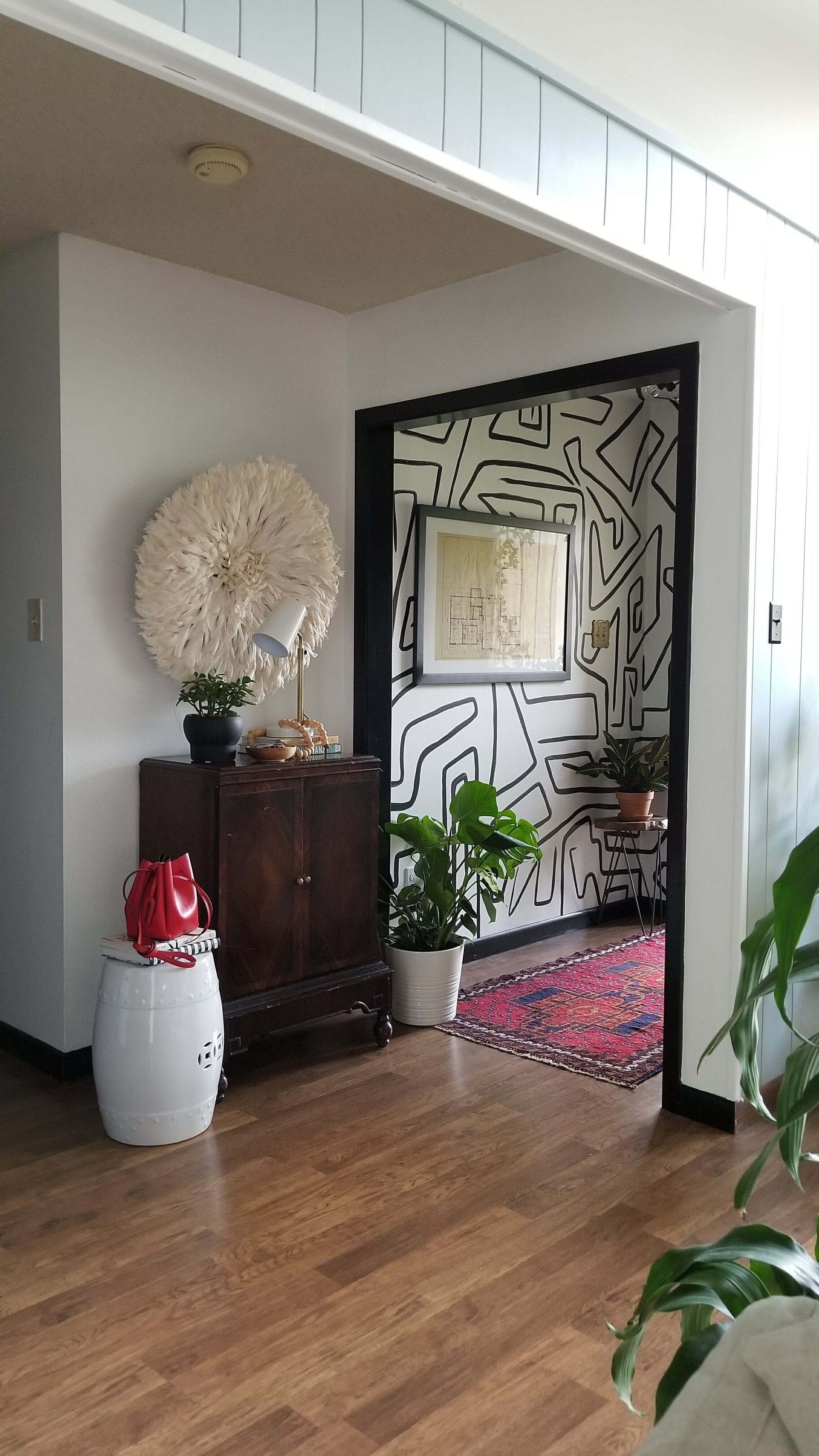
And since I know the point of you all being here, I won’t waste your time with a ton of words. But I do want to say a little bit about this whole entire process! We’ve been in our home now for 4 years. Two months in, I gave the entry and hallway a fresh coat of white paint (Behr Ultra White) and painted all of the doors and trim black (Glidden Onyx Black), but I didn’t get the idea to hand mural our entryway until 18 months later!
I always knew I wanted to give the hallway a similar treatment, but could never put my finger on what that was. I’d thought of more designs I could hand paint, but none of it felt right. It was either competing with the entryway (which I knew I wasn’t going to change), or it was dramatic enough to even compliment the entry. Here we are, almost 3 years later, and I’ve been blessed with what I think is the perfect fit to what I’ve been looking for!
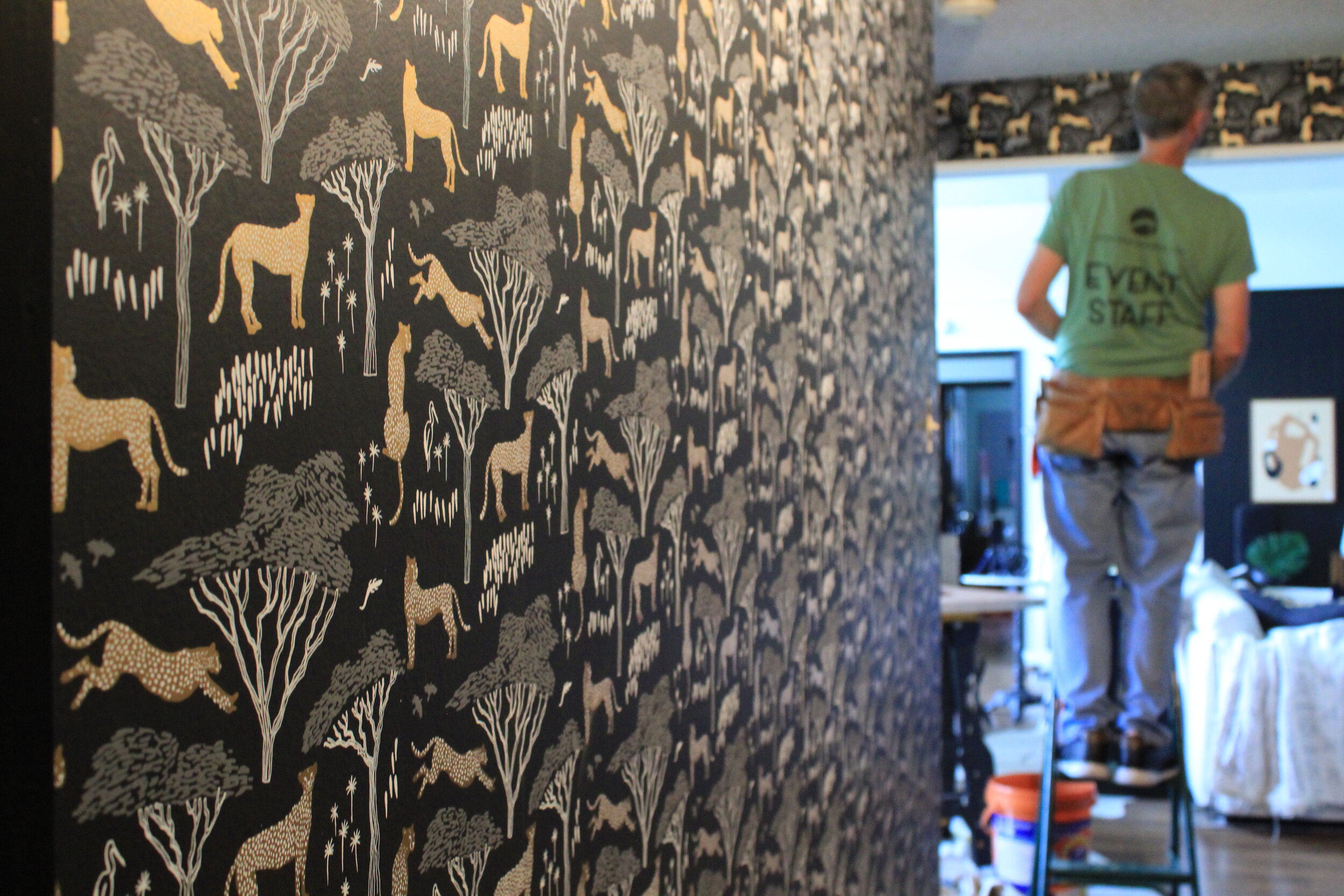
The amazing people at Hygge & West reached out to me for an opportunity to collaborate and work with one of their amazing wallpapers and I couldn’t say yes fast enough! I knew that this was my chance to find what our hallway needed! I went through the site looking for designs that spoke to me and my family. I knew I wanted something bold, something black and something that felt like it could speak to the family that lived here. I picked out a few samples, but when they all arrived, our decision was clear. Hubs, Davin and I all unanimously chose the Serengeti design by Julia Rothman in the Ebony colorway.
It was bold with it’s graphic pattern and gold cheetahs. It had a background that was black and moody. The Serengeti scene was indicative of the landscapes of our African ancestors and just felt like home. (Pattern story: After artist, Julia Rothman, traveled to Uganda, she wanted to capture the vast and beautiful landscape she’d experienced. This design with cheetahs and birds scattered amongst the acacia trees was created to reflect the beauty of the African plains.) It was perfect.
I sent the H&W team all the info and dimensions of our hallway and they told me how much paper I needed. It was a total puzzle for me with all the doors, but what I learned is that you, ultimately, have to include them. We were sent 8 of the double rolls, which are all 27 inches wide and 30 feet long, and ended up using 5 full rolls and a little bit of a 6th. It took my installer about 6 hours to complete the job and it was one of the most fascinating installations to witness.
So now, let’s jump into the whole shebang, shall we?!? Here’s all of the before shots of our hallway.
And here’s the process of it all going down!
My installer, Sam, even took the time to wrap our outlet and switch covers and that made all the difference in such a seamless look!
Sam did an amazing job, and if you’re in the Memphis area and want his info, let me know!
You ready to see the afters? (Is that a dumb question?) LOL!
Photo credit: Kim Thomas of KPFusion
Photo credit: Kim Thomas of KPFusion
Above: art by me framed in IKEA Ribba frame; below: art by Monica Lewis of Monica Lewis Art framed in Michaels’s Gallery frame
Original floor plan of our home from 1977 custom framed at Michael’s.
Art: DIY by me; cabinet: heirloom from my great grandmother; lamp: Walmart (old); orb planter: West Elm (old); wooden bowl: vintage; plant hanger: Amazon; plant: pothos
Entry mural hand-painted by me; rug: vintage find from ecarpetgallery
Photo credit: Kim Thomas of KPFusion
What do you think, peeps!? Let me know in the comments below! ! I’m so in love and couldn’t be happier with how this wallpaper has transformed our home! Thank you so much Hygge & West for this collaboration opportunity! This space totally would not have happened without you!
This post was sponsored by Hygge & West via gifted product, but all thoughts and opinions are my own.

![20170902_120122[1].jpg](https://images.squarespace-cdn.com/content/v1/5cd3939701232c60ded395e6/1592066457258-PWFJSU97FE4C973BGNM2/20170902_120122%5B1%5D.jpg)
![20170904_103533[1].jpg](https://images.squarespace-cdn.com/content/v1/5cd3939701232c60ded395e6/1592066478401-YORF2LMQWIJY2A31HLBX/20170904_103533%5B1%5D.jpg)
![20170904_135313[1].jpg](https://images.squarespace-cdn.com/content/v1/5cd3939701232c60ded395e6/1592066500120-EYGVGQ7NVZ8OW64LR0KW/20170904_135313%5B1%5D.jpg)


