Saturday Styling: A Console Styled 3 Ways
Happy Saturday Peepsicles! I'm back with another installment of Saturday Styling! This week, I turned my attention to my "new to me" Brutalist style dresser. Check out how I gave this piece it's unofficial welcome to #nubihouse.
So, with a rare moment of free time, I got to work styling "seen better days" Sally. But I didn't just style it once, I styled it THREE TIMES! A few disclaimers:
1. I repeat, the dresser is in bad shape. It looks as if she sat near water at some point. As you scroll through, just imagine that she's in immaculate condition until I get in contact with a refinisher.
2. If I weren't completely in love with my art, I would've selected other options for this space. But, as you can see, it's not going anywhere!!!
3. Once you make it to the end, you have to let me know which look is your favorite!
Look #1
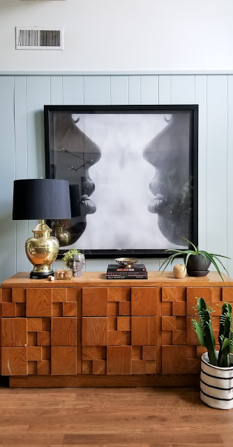
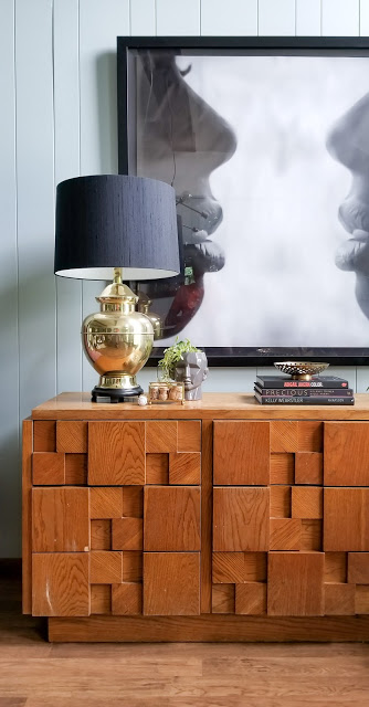
For look #1, I brought in my vintage brass lamp with black shade. It was the kick off for everything else that you see; a little bit of black. a little bit of brass.
I found the lamp, sans shade, at a vintage shop here in Memphis a couple years ago. One day, I stumbled across
Lamp Shade House off of Summer Ave. (it's literally a store specifically for lamp shades and lamp parts) and they had this huge black silk shade on clearance for only $20! Total score!
The small glass box is my collection of champagne corks from past special occasions. Before I put them in the box, I like to write the date of the occasion on the cork so we can always reflect on the special day.
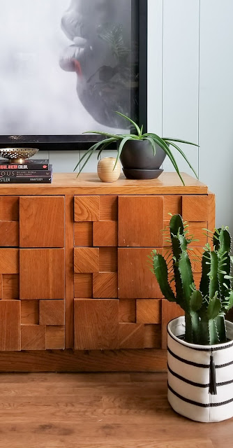
No vignette of mine is going to exist without plants. I brought over my long-legged aloe plant and a euphorbia cactus that is, to my surprise, flourishing and doing well.
Look #2
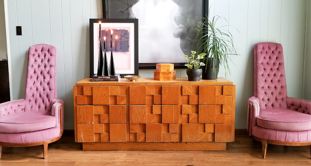
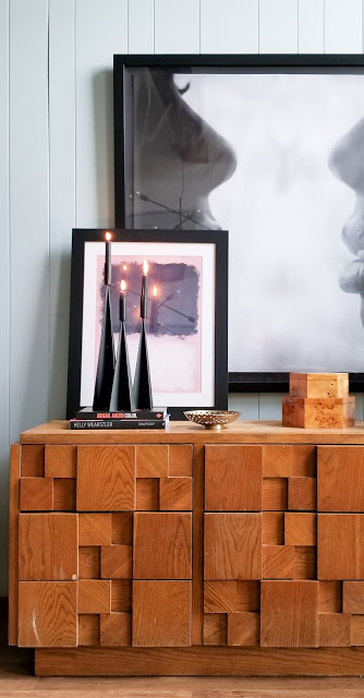
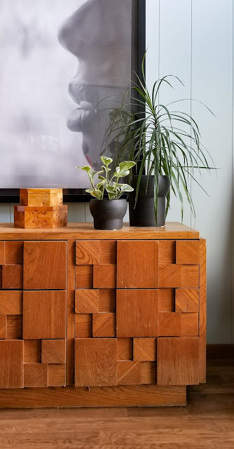
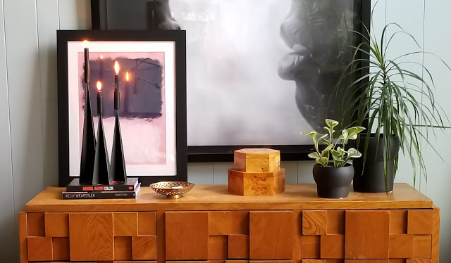
For look #2, I amped up the black elements, changed up my lighting source and tried out some layered art.
Candlelight is great for areas that don't require task or general lighting and the geometric form of these candlesticks pair perfectly with the mid-century modern dresser.
I doubled the plant play, because duh. I introduced another wood tone by bringing in the burlwood boxes. They're perfect for additional storage and corralling smaller items that you don't want rolling around in drawers.
Look #3
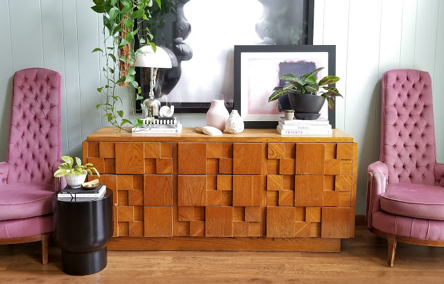
By the time I got to the look #3, I was getting board with all of the straight lines and angles and the lack of variety that I was getting by keeping from keeping the art.
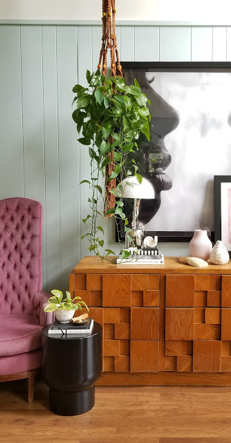
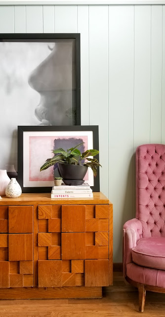
Any time I need to break things up or distort lines, I bring in plants.The bushiness of a pothos or croton plant are perfect for creating lots of visual interest...especially if they can live on an unexpected surface. And what's more unexpected than suspension?
And since I wanted the plants to be the stars, I went smaller on the scale of the light fixture. And to contrast against the organic shape of the posthos, I went with a lamp with a super defined shape and modern style. And to draw attention to my croton plan, I layered the second piece of art right behind it. This now forms a visual triangle of sorts; the eye bounces from the pothos to the croton to the lamp.
And I have to mention that for this look, I went beyond the black and white and brought in more hints of blush. There's plenty in the chairs that flank the dresser so it didn't take much. The layered art, a vase and a few books with pink(ish) spines was all it took.
Can you tell which one I love most?
Since a lot of my exact items are no longer available, I've taken the liberty to source a few items that I would've loved to incorporate in any of these looks! Feel free to shop them for yourself!
Lighting


